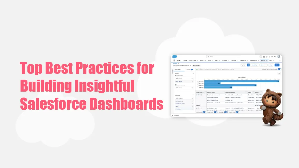
Best Practices for Building Insightful Salesforce Dashboards
Are you worried about your business performance? Are you unable to have an overall view of your business data? Look for a Salesforce Dashboard that visually represents your business data. It is like taking all the reports your teams create and turning them into easy-to-read charts and graphs.
It simplifies complex raw data by turning it into visual representations like charts and graphs, making it easier to identify weaknesses or opportunities for growth. These dashboards allow you to create visual summaries of your reports, helping your teams make informed decisions.
In the blog, we will see the best practices for building insightful Salesforce dashboards. Here we go!
Top Key Practices for Building Insightful Salesforce Dashboards
Dashboards effectively convey important information and support decision-making. Here are some best practices for building effective Salesforce dashboards:
Define Clear Objectives
Begin by defining the specific goals or KPIs (key performance indicators) you need to monitor. Knowing exactly what you’re looking for will help shape your dashboard’s design and content.
Keep It Simple
Less is more! Focus on the most important metrics that match your goals. A clean, simple layout helps users quickly understand the data without feeling overwhelmed.
Use Appropriate Visualizations
Pick the best visuals for your data. For example, bar charts are great for comparing numbers, line charts show trends over time, and pie charts work well for showing proportions.
Organize Layout Logically
Put the most important information at the top or in a prominent spot. Group related data together so users can easily follow the flow of information.
Incorporate Filters and Drill-Downs
Give users the ability to filter or dive deeper into specific data points. This interactivity allows them to explore the data in a way that suits their needs and dig into the details when necessary.
Ensure Data Accuracy
Always make sure the data feeding your dashboard is up-to-date and correct. Inaccurate data can lead to bad decisions, so it’s important to maintain data accuracy.
Make It Actionable
Your dashboard should do more than just show data – it should help users take action. Include insights, alerts, or recommendations that suggest next steps or link to more detailed reports for further analysis.
Use Consistent Formatting
Stick to a consistent color scheme, font, and layout throughout the dashboard. This makes the data easier to read and gives the dashboard a professional, unified look.
Regularly Review and Update
Dashboards aren’t set-it-and-forget-it tools. Regularly review them to make sure they still align with your business goals and update them as needed to reflect any changes in strategy or data sources.
Examples of Common Salesforce Dashboards
Salesforce has a variety of dashboards to choose from, depending on what your company needs. These dashboards can help your sales and marketing teams keep an eye on campaign progress, track customer requests, and spot upcoming trends. Ready to dive in? Let’s explore some common examples of Salesforce dashboards.
Forecast Dashboard
Got a sales or marketing team that needs to stay on top of customer trends? The Forecast Dashboard is your go-to tool! It helps you see how these trends affect revenue, and it’s perfect for holding your team accountable for hitting targets.
Here’s what the Forecast Dashboard pulls together:
- Sales forecasts by region
- Individual performance predictions for your marketing and sales teams
- Team-wide sales forecasts
- Sales progress at each stage of the funnel
Sales Funnel Dashboard
This one’s a favorite—the Sales Funnel Dashboard! It shows the three main stages of your sales process in a funnel-shaped chart, making it easy to see where your leads stand:
- Prospect Stage: Checking out your leads.
- Investigation Stage: Drafting proposals and sending them off.
- Negotiation Stage: The final talks before turning those leads into sales.
With each phase laid out clearly, you can see exactly how your sales process is moving forward.
Marketing Executive Dashboard
Want a clear view of your marketing campaign’s progress? The Marketing Executive Dashboard gives you a detailed report on how things are going. Senior managers will love how easy it is to track lead generation and conversion rates, plus it provides access to critical reports like billing and inventory.
Customer Service Supervisor Dashboard
Customer service is the heart of any business, right? With this dashboard, department heads can track customer feedback and follow cases from start to finish. It’s a great way to see how well your team is handling customer interactions and find opportunities to improve the process.
Wrapping Up
Salesforce Dashboards are an essential tool for transforming raw data into meaningful insights, helping your team make smarter decisions and drive growth.
If you’re looking to enhance your Salesforce implementation or need help optimizing your dashboards, The Pinq Clouds is here to help! Our expert consulting team can tailor Salesforce to meet your specific business needs and empower your teams with powerful data visualization.
Get in touch with The Pinq Clouds today to unlock the full potential of your Salesforce platform. Also, don’t forget to visit our blog for the latest insights and tips on Salesforce features and updates, helping you stay ahead in the Salesforce ecosystem!